
At the intersection of work and wellbeing.
Client: Zorg van de Zaak
Industry: B2B, Occupational Health
Assignment: Rebrand & Implementation
Goal: Matching the brand with its new market focus
Zorg van Zaak is one of The Netherland’s largest occupational health services. They deliver comprehensive occupational health services to large organisations, focusing on proactive absence management, employee wellbeing, and tailored interventions. Because they believe that a healthy company means happy employees.


Context
The old brand existed in a complex brand architecture, of a mother company and sister companies, all bearing the same name, with different modifiers. An internal reorganisation liberated the name Zorg van de Zaak from that constraint, and thus available for a rebrand. And that was necessary too. With a renewed vision and methods, and a more specified target audience, the old brand didn’t hit the mark anymore.
The assignment
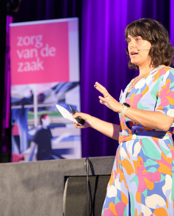
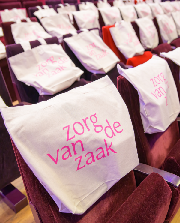
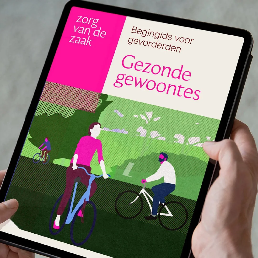
Revolte was tasked to completely rebuild the brand. We preserved the brand equity by retaining the name, main slogan and the primary color. (Though we gave that magenta a little boost.) In the strategy meetings we decided that with the new focus on larger organisation (>500pax) the brand should present as a bit more refined, elegant, but still approachable. It should give an editorial feel: a well put together quarterly magazine for a distinct audience, instead of a daily paper for the masses.
Four visual concepts
The brand employs four visual concepts that make it work.
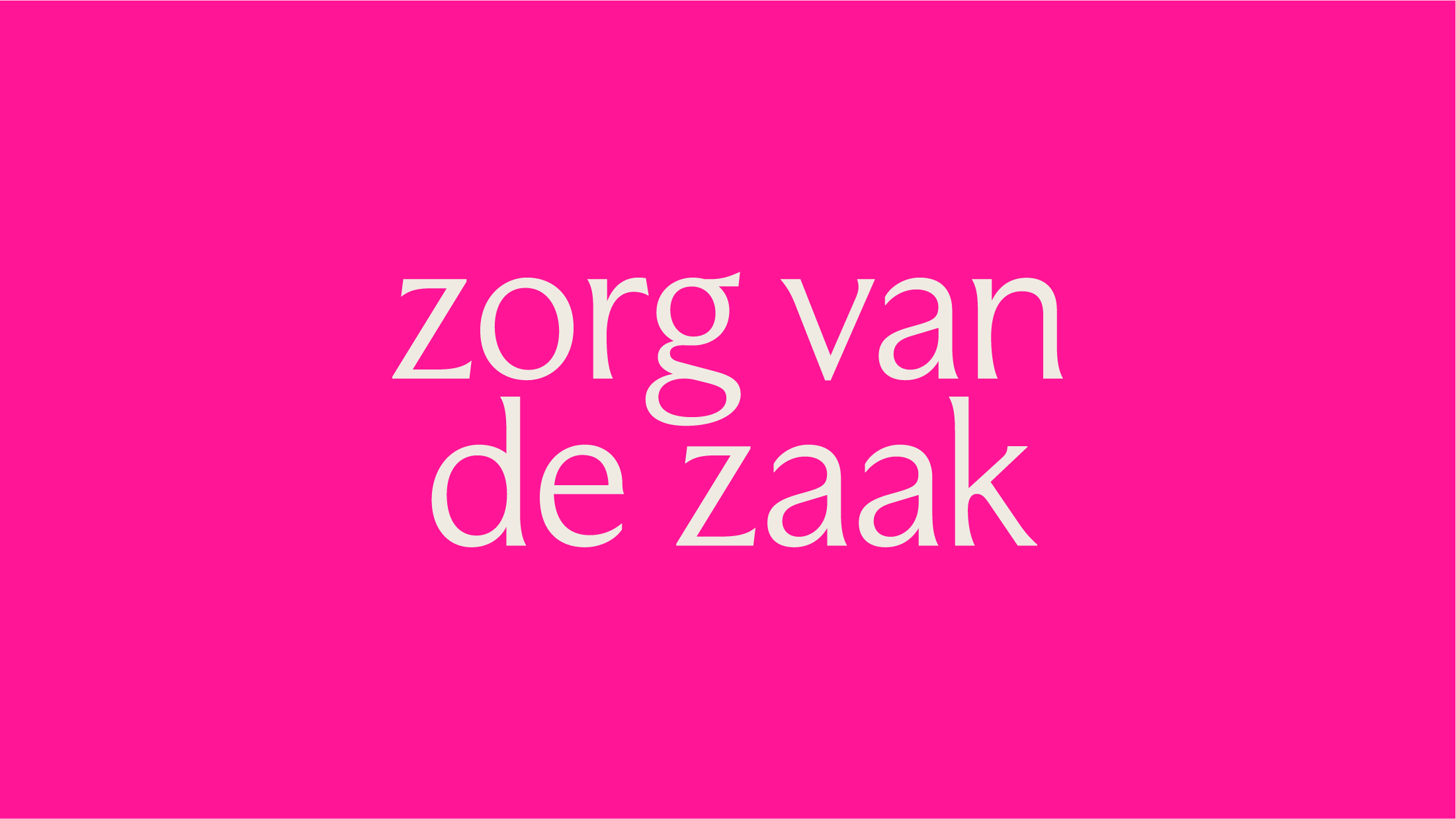
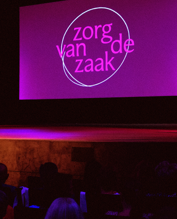
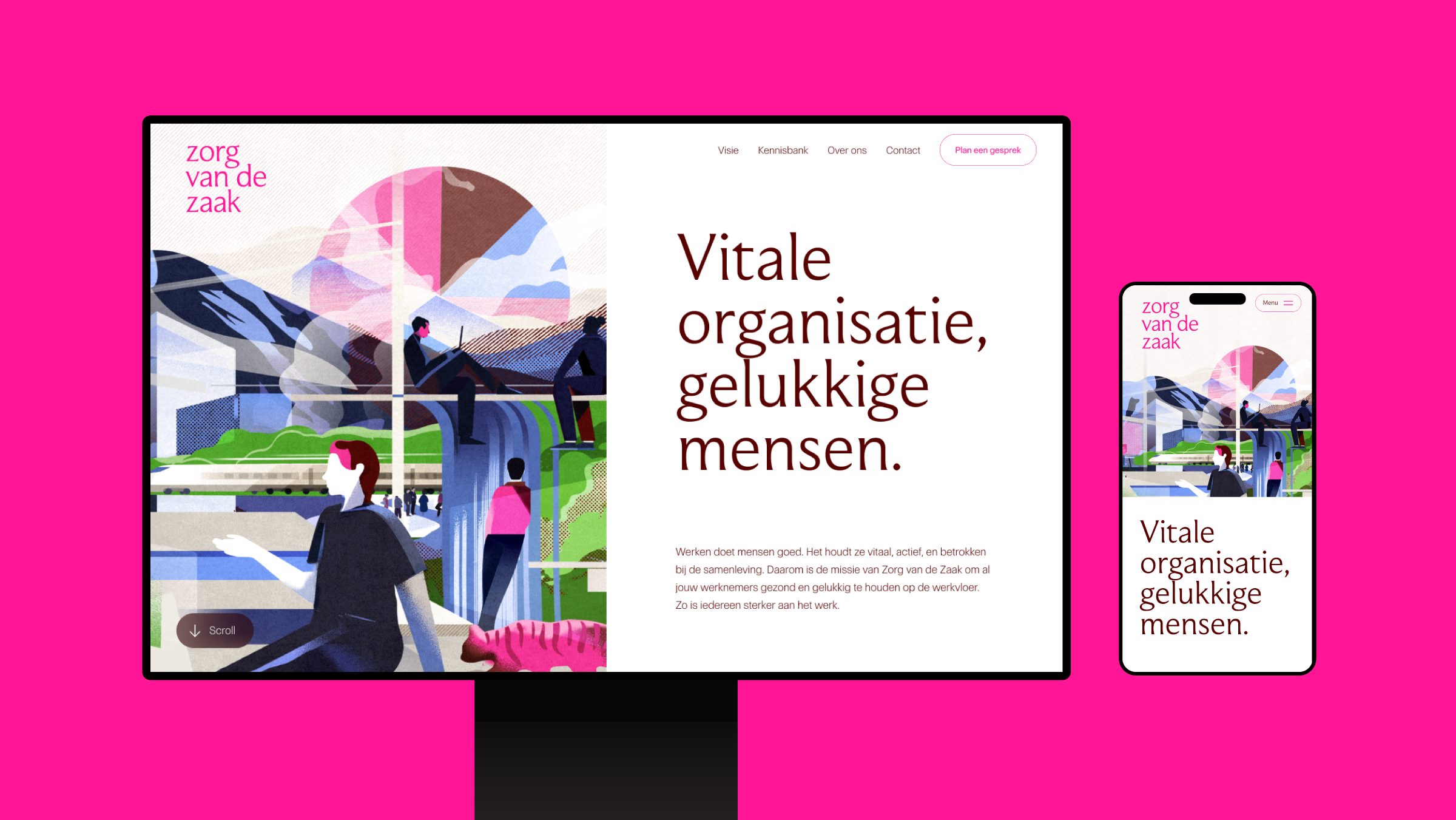
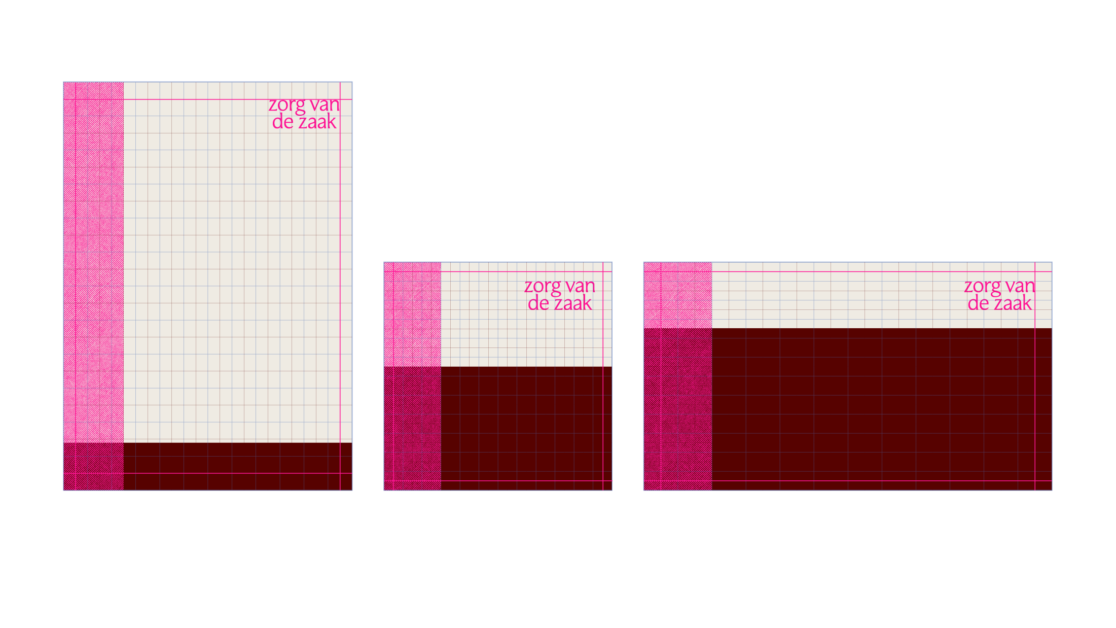
Flexibility wordmark
The first visual concept is the adaptability of the wordmark. Having multiple lockups is not remotely unique, but Zorg van de Zaak truly has no primary logo. We use what fits best in every instance. We signal our adaptibility and tailored solutions. We fit the you want us to.

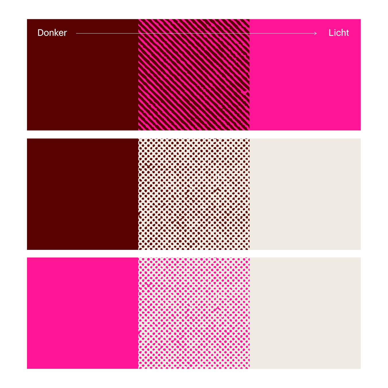
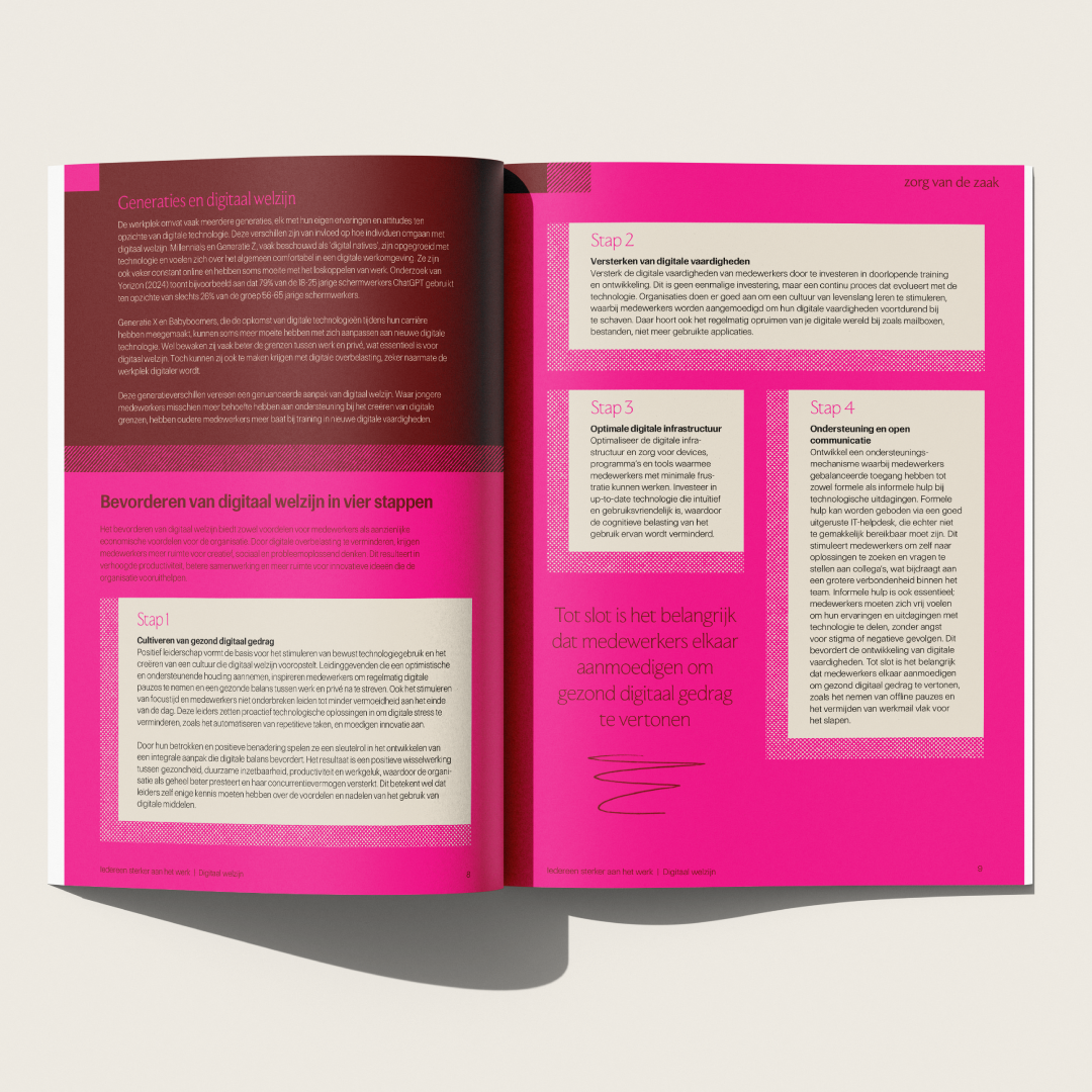
Patterns
Zorg van de Zaak focusses on where work meets wellbeing, where professional life meets private life. That isn’t always smooth or perfect. This can be seen in the brand patterns From a distance they seem to be a lighter shade of the base color, but at closer inspection they are a rough-edged pattern of two different colors.
Doodles
To remind everybody that - though we are a large company servicing even larger organisations - we’re still providing human care and solutions, we’ve sprinkled hand-drawn doodles, encouragements, and exclamations throughout the brand. Humans after all.

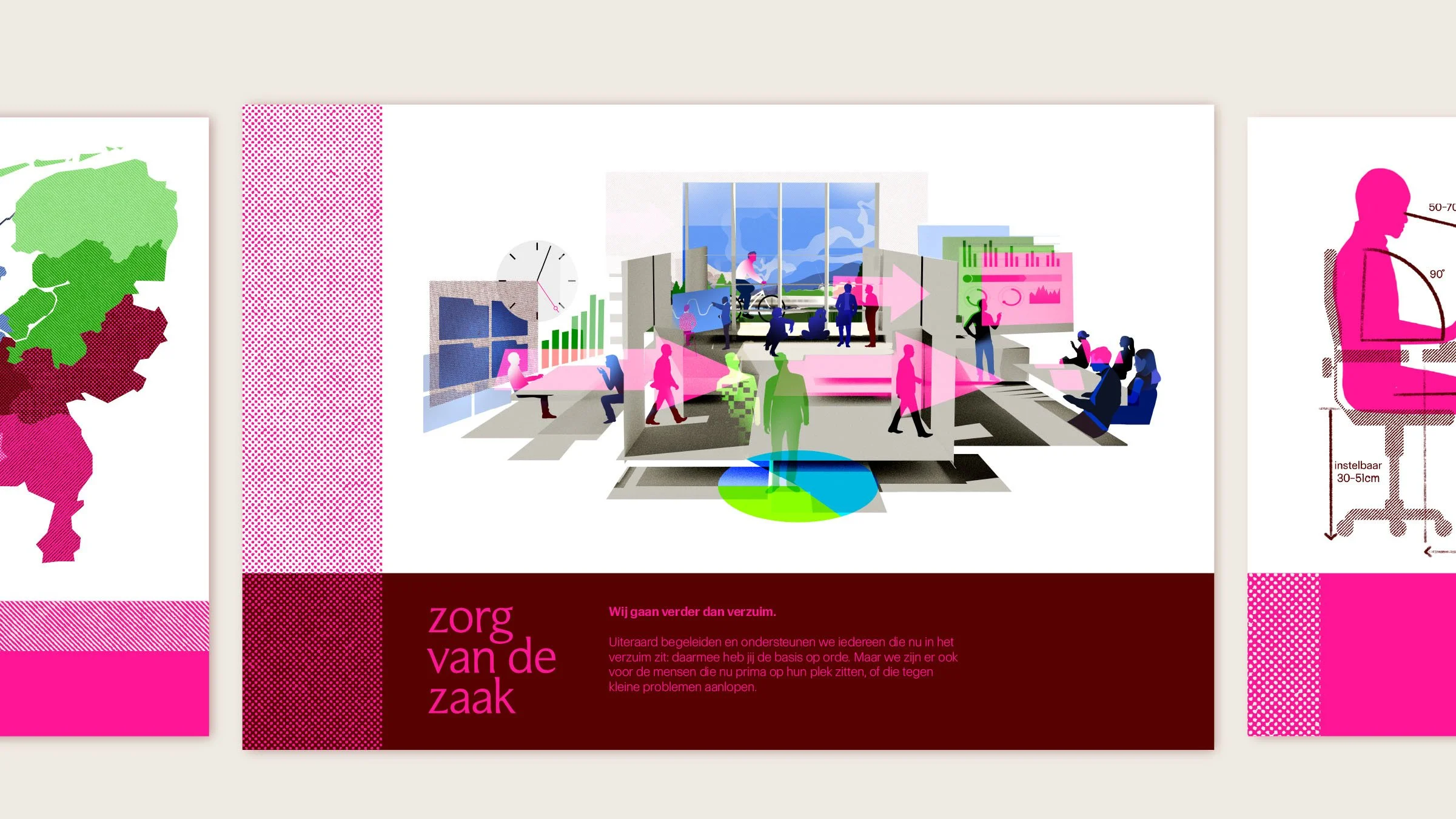
Illustrations
We’ve developed a rich and vibrant illustration style for the brand. A lot of topics in the occupational health field are hard to visualise, like burnout, absence, work-life balance. At least without resorting to overused clichés. We decided to build five landscapes from which to lift images that fit the usecase. The accompanying text will load the image with the right meaning.


“I’m super proud of our new look. Massive thanks to the Revolte team for delivering this fresh and powerful rebrand. You’ve helped us to revive this brand. Thanks for the energy, creativity and the pleasant partnership.”
Charlotte Kloet
General Director
Zorg van de Zaak
Client
Zorg van de Zaak
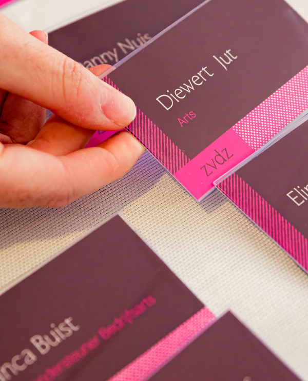
Our team
Illustrator: Katarzyna Surman
Copywriters: Firma Fluks
Web developer: Diffuse
Photography: Jeroen Berends
Motion graphics: Max Philippi
Questions about this project?
Ask Erik
Erik Ankoné
Founder / brand strategist
Revolte Studio
