

A brand where all men feel welcome and understood
Client: Sandstep Healthcare
Industry: Healthcare
Assignment: Branding, Logo, Identity, Copy
Goal: Repositioning and rebranding of an existing clinic
The Mansani Kliniek is a urology clinic for men. When it comes to your private parts, you want two things: a top specialist, and to feel heard. At Mansani Kliniek you will be served on both fronts. The relaunch of the clinic was an excellent opportunity to establish a strong, striking and attractive brand. The father-company Sandstep Healthcare and chief urologist of Mansani Dr. Garry Pigot tasked us to cook up this brand new identity.
The assignment
A complete rebrand: name, logo, visual identity. Everything.
Specialist clinics need to sit well with two different audiences. There’s the patients themselves, but also the medical professionals that refer them to the clinic. The main focus is on the patient, as the decision is ultimately up to them. This group can further be divided into men with medical problems, and men with elective requests.
The name
The name is derived from 'mangh sani'. This means 'man things' in Surinamese, where Dr. Pigot has its roots. We cleaned up those two words and merged them into Mansani. This benefits the ease of writing and recall, and in addition to the Surinamese meaning it evokes the association with a sanitized, top quality medical environment.

The story
Making men enjoy life again.
We treat men with urological complaints or requests.
Every man is different and everyone has their own story. So we draw up a treatment plan taking your personal situation into full account.
In our clinic with state-of-the-art operating room, our specialist team provides the absolute highest quality of care.
So that you can get back to being yourself again.

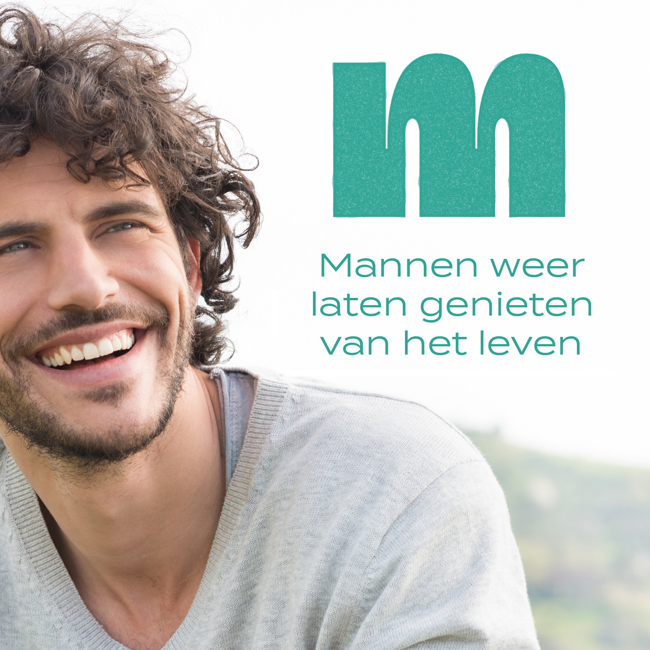
Wordmark
Unique, handmade typography.
To make the wordmark feel accessible, we chose to keep it lowercase. Yet it still feels sturdy and established due to the weight. The repetition of round shapes on the uppers makes the wordmark human and approachable.
Aligned under 'man' is the description in a secondary typography. With this lockup, we reconfirm that this is a clinic for men.


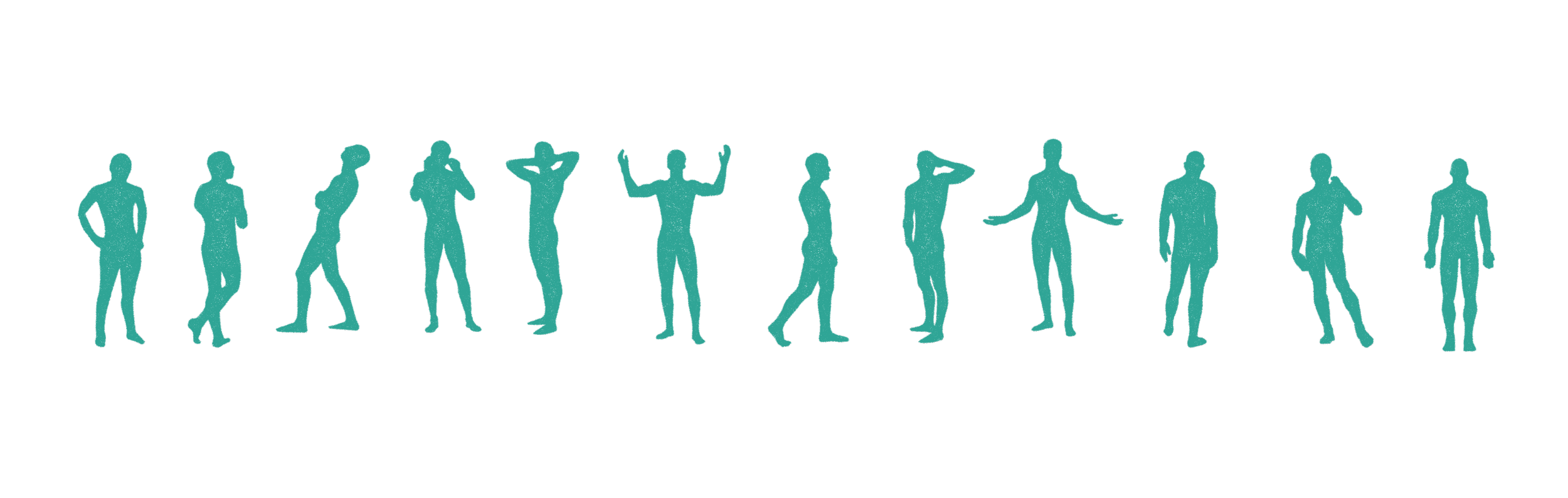
Visual identity
We designed two complementary visual languages. A human perspective and a technical one. The first for the personal, open characteristics of the brand, and the other for the practical, specialist side.
The first regards man in its totality. Head to toe. Portrayed in silhouette so that any man can identify. This viewpoint offers a holistic view of man. You can look at him from all sides, and the different poses express many different emotions and energies.
For the second visual language we’ve made a technical drawing of the male anatomy. Here we emphasize the specialist side of the brand in a light-hearted way. The image is based on exploded view diagrams found in maintenance manuals for all types of machinery. We show we know our way around male anatomy and we are well-equipped to work on it.


Client
Sandstep Healthcare
Worth mentioning
Original ‘M’ icon by Matthew Smith
Webdesign by Websteen
Questions about this project?
Ask Erik
Erik Ankoné
Founder / brand strategist
Revolte Studio
